Data Visualization - Replit
Data visualization is the representation of data through graphics, whether that be through charts, plots, or even animations. These visuals communicate complex data relationships in a way that's easy to understand. In stem skills, this is just what we did with python for planets, graphs, etc.
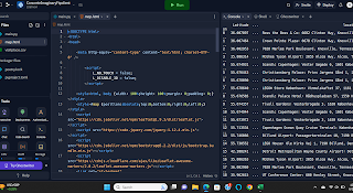
For visualization 1, I decided to change the planet's color. Here we just used Replit to understand coding and how to upload a file and embed code.
Visualization 2 - I learned how to download a program and csv file. This way I was able to take information from one program and upload it in relation to a csv file. Two networks could work together to make a list of places based on location of longitude and latitude.
Visualization 3 - I learned how to upload a file that would form a scatter plot. For this visualization, I used ChatGPT to help create the program for the rest of this visualization.
Visualization 5 - I learned how to use google maps data to code someone's various locations throughout an extended period of time. This was the same principle as visualization 2, however, with the use of personal data being used. From this exercise, I had to convert someone's personal data from a json file to a csv file, as this is the file type that'll translate into Replit. This was really fun, as it was like a real-world problem, and you could actually visualize what code can do.


Comments
Post a Comment